Fine Art vs Traditional Prints
November 1st, 2016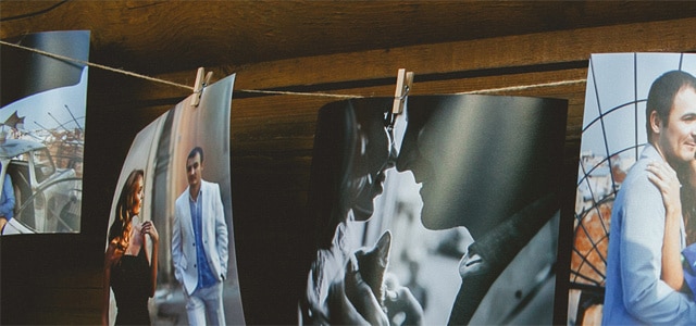
[vc_row][vc_column][vc_column_text]
The title of the blog tends to suggest that there is some sort of competition between the two mediums – that one is better than the other. While some could argue this is true, it would be more pragmatic to say that the most suitable paper type for any given image depends greatly on the subject matter.
Fine Art Prints
Fine Art ‘Giclee’ (aka Inkjet) prints are super-popular right now, and have been for a while. Why? I believe because they offer photographers a greater choice and enables you to align a paper to your brand or style of photography. Depending on the surface texture, Fine Art prints can give a beautiful, painterly effect to your images. The paper itself is also thicker and more tactile, with some providing slight colour casts that can add extra atmosphere to your shots.
The downsides are that they are slightly more expensive, need handling with care as they can scratch quite easily ,and they don’t produce quite the same depth of detail in shadow and highlight areas as photographic prints. To some, these prints can look flat, almost ‘wrong’ because of this ‘blocking up’ of the image. Every time we show fine art papers, we always hear plenty of “Oos!” and “Aaahs!” as people express their delight at the textures… They look amazing with the right image – perhaps more ethereal portraits, backlit in sunlight. Lifestyle images work well, as do abstracts, nature and landscape images.
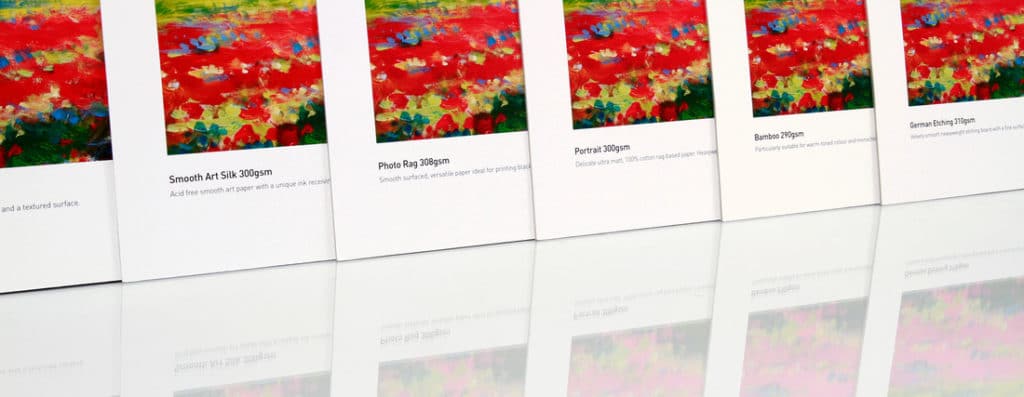
While there arguably isn’t ever a ‘right’ or ‘wrong’ paper for a given image, careful paper choice can help bring out the qualities in the image you’re looking highlight. For example, you may want the warm tones in your abstract landscape photo to shine through on a smoothly textured surface – in which case Bamboo would be a good choice. Or perhaps you’re looking to showcase your prize portrait study in a painterly way with truer-to-life colours – in which case a more heavily textured paper like Portrait or German Etching would be more suitable.
Each paper has its own unique character and strengths, so the best way to decide which you prefer for your style of photography which is by getting hands-on with a few samples.
Traditional Prints
Traditional (aka C-Type) prints on the other hand – particularly when printed on a Lightjet – have a deep contrast, punchy, accurate colours and razor sharp resolution. After all, the technology was invented by NASA to chart the stars with laser precision. There are many different surfaces and textures to choose from: lustre, gloss and metallic.
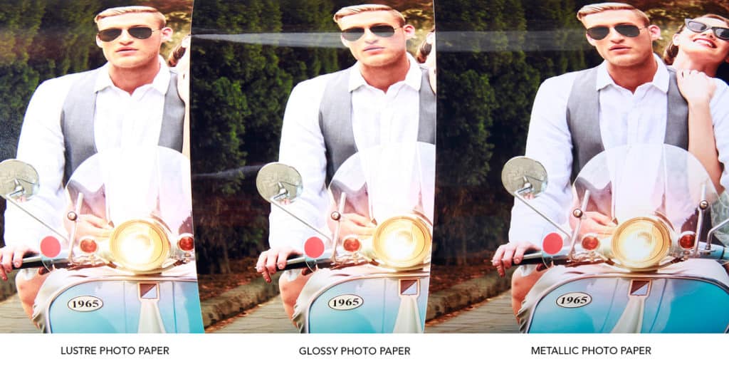
Lustre, by far, is the most popular as it has a more matte look and it resists handling and finger marks brilliantly, yet still has all the technical qualities a professional lab needs – longevity (30 years) and precision.
Gloss, though stunning has dropped in popularity in recent years. One of the issues being finger marks, the other when framed is Newton’s Rings, the weird petrol spill-like distortions created by reflections in the acrylic ‘glass’.
Metallic paper and gloss are similar in their look, until closer inspection where you see metallic-esque highlights; the paper appears to have a ‘depth’ to it. Black and white images look amazing on metallic, as do bright, contrasty portraits.

It’s easy to assume that photo paper is just paper, and that fine art papers are the answer to all our woes. However, you need to choose carefully and pick the paper to suit the mood and style of the shoot. You may not ruin the shot, but you could spend more than you need or reduce the qualities/style you have spent valuable time and effort creating.
|
Adam Scorey is a professional photographer, ex photo-magazine editor and now Product and Marketing Manager for One Vision Imaging. |

[/vc_column_text][/vc_column][/vc_row]